⚠ Content warning I talk about using AI to do stuff in this post. I know some of you want nothing to do with that. The parts actually written by AI are indicated.
I worked with Claude Code, using the amazing Impeccable skills, to clean up the layout and typography here. We spent about an hour and a half and I'm pleased with the results. Things are cleaner and more consistent.
After asking Impeccable for a /critique, it presented a list of issues and suggestions. We spent a few rounds reviewing and trying things. Claude would edit templates and CSS on the fly and I'd watch the (11ty) page reload and update in real time. Impeccable is geared specifically toward design. It's "Design fluency for AI harnesses".
I found the entire process to be a delight. I was giddy at times. It makes me feel like I can do anything.
Here's what it came up with (copied and pasted as is). It's long, but damn:
Claude Code's critique...
Design Health Score
- Visibility of System Status (Score: 3)
Pagination state is clear; nothing else needed - Match System / Real World (Score: 2)
"Permalink #" is developer-speak; content types not visually distinct - User Control and Freedom (Score: 3)
RSS, search, pagination all present - Consistency and Standards (Score: 2)
--color-mutedand--font-size-mdreferenced but undefined; cover images lose styling outside.post-body - Error Prevention (Score: 3)
Static blog, minimal to prevent - Recognition Rather Than Recall (Score: 2)
Notes look like broken posts, not a distinct type - Flexibility and Efficiency (Score: 2)
Welcome block repeated on every page-1 visit for returning readers - Aesthetic and Minimalist Design (Score: 2)
Welcome header competes with content; uniform card treatment flattens everything - Error Recovery (Score: 3)
N/A mostly - Help and Documentation (Score: 3)
Social links and bio help new visitors
Anti-Patterns Verdict
Not AI slop. The page is clean and doesn't trigger the obvious AI tells — no gradient text, no glassmorphism, no hero metrics, no glowing dark cards. The problem is the opposite: too generic in the direction of "blog template" rather than a specific design with personality.
Automated scan flagged one issue — "single font family" — which is a false positive. It analyzed the .njk files, saw only Hanken Grotesk referenced explicitly, and missed that Vollkorn is applied via CSS classes. Both fonts are active.
Overall Impression
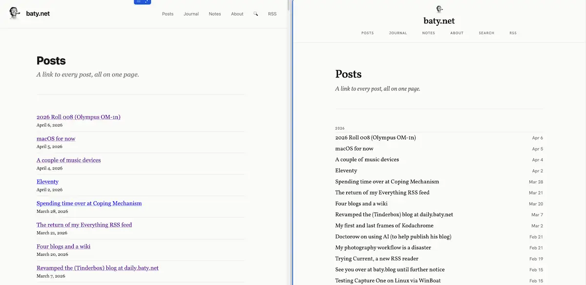
The page does what it needs to do, but it makes no choices about how the three content types feel differently from one another. Posts, journal entries, and notes all render in the same container with the same spacing and the same treatment. That works structurally, but misses the character of each type. The biggest win available here is giving notes especially a visual identity that's distinct from posts.
What's Working
- The excerpt pattern. Using
<!-- more -->to let the author control what shows in the feed is smart and produces a natural-feeling stream, not a wall of truncated cards. - Post meta. Date + tags at the top of each card is clean and well-weighted — it doesn't compete with the title.
- Content routing. The three-way
if/elif/elifin the template is handled correctly, including suppressing note titles on the feed. Good information architecture underneath.
/ end of Claude Code's critique
Then it listed what needed fixing and how we'd fix it. We decided to do the following:
- Welcome header: removed entirely
- Social links: relocated to footer (permanent, visible on all pages)
- Footer: restructured to 3-column layout (copyright / social icons / nav links)
- Notes: compact card — smaller meta (0.72rem, 70% opacity), smaller body (font-size-sm), narrower measure (52ch), tighter separator (space-md vs space-xl)
I mean, there's no way I could do this on my own. I wouldn't even try. And I would not have hired a professional to do it. It's just my blog. The world is different now. It's equal parts exhilerating and scary.